Nowadays there are sufficient statistical data available (also on the internet) to compare the performances of various economical systems. Thus time series can be constructed, as well as cross sections for a number of states. The present column makes such an analysis for the economic growth rate, the labour productivity, the unemployment, the budget deficit, the public debt, the trade balance, and the size of the administration. The data are copied from the files at Eurostat and at the Groningen Growth and Development Centre.
In the column about the European Union it has been explained, that she can only function, as long as the welfare in the member states is not too different. Therefore it is desirable to compare the economic situations in the various member states. This is obviously done in many publications, but they are not always sound. Namely, the comparison is often restricted to a single moment in time. And that can give a distorted picture of reality, because due to special conditions member states can temporarily excel or fall behind. An honest comparison between member states requires, that use is made of long time series1. The present column presents such a comparison.
Since the Second Worldwar an enormous amount of statistical information has been collected with regard to the economic developments in the European states, and incidentally in other modern industrial states as well, such as the United States of America (in short USA). Your columnist does not have the ambition to make all this information available and accessible. On the contrary, the argument here is based on merely two data files, which are accessible for everybody at the internet. They are, firstly, the Conference board total economy database (in short CBTED), which can be consulted at the website of the University of Groningen. The interesting aspect of this file is, that the time series go back a long time in the past, namely until 1950. And, secondly, time series have been taken from the Eurostat database (in short ESD)2.
Data have been abstracted from these files concerning the themes, that have until now dominated in the columns of the Gazette. Thus the theory, which has been presented in the previous years, comes to life. Sometimes the data of the files are slightly transformed, before they are shown in a figure.
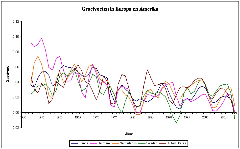
Figure 1: Economic growth rates in Europe and in the USA
The human well-being increases according as the people can dispose of more material wealth. Therefore in the previous columns much attention has been paid to the growth rate of the gross domestic product (in short GDP). For the present purposes the growth rate is defined as
(1) g(t) = (GDP(t) / GDP(t-1) − 1) × 100
In the formula 1 GDP(t) represents the gross domestic product at the end of the year t. It is multiplied by a factor 100 in order to express the result g(t) in percents. The definition of the formula 1 implies, that here g(t) is made discrete in such a manner, that it is constant during the year. At the turn of each year the growth rate assumes a new value.
It turns out that the growth rate can vary considerably from one year to another. Since that leads to graphs with a disorderly shape, here it is preferred to compute the three-year moving average of g by means of the formula g3(t) = ¼×g(t-1) + ½×g(t) + ¼×g(t+1). The result is shown in the figure 1 for the European states France, Germany, the Netherlands and Sweden, as well as for the USA. In this case the data are taken from the CBTED, for the years 1950-2009. Naturally, in the formula 1 the possible occurrence of inflation must be taken into account. For, one is interested in the true growth, and not in changes due to the devaluation of money. Therefore, here those GDP-time series from the CBTED have been copied, that are transformed to the price level of 2009, in dollars.
The reader can check for him- or herself, that the time series in the figure 1 contain a lot of information. First, consider the similarities between the five time series. The West-European growth rates are highest immediately after the end of the war, because the reconstruction offered a wide choice of very profitable projects. Since the seventies the growth rate falls. Furthermore, the growth rate is usually positive, apart for some exceptions. Nevertheless, it is striking that g(t) varies considerably, even though the national fluctuations appear to be mutually synchronized. These are the well-known conjunctural fluctuations of a meanwhile global economy. The unrest around 1955 is probably an aftermath of the Korea conflict, which lasted from 1949 until 1954, and which started the Cold War3. The deep troughs around 1973 and 1979 are caused by the two oil crises. They mark the end of the economic "miracle" in the western states.
There are also several striking differences. Notably after the oil crises the USA exhibit a higher growth rate than Europe. In addition, during that period the North-Americans began to work structurally longer than the Europeans. It seems logical to attribute the American success to this difference. It is obvious that more material welfare has huge advantages. For instance, the extra money can be expended for the improvement of care, education and the infrastructure.
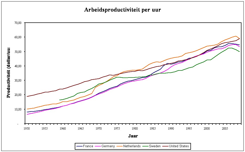
Figure 2: Labour productivity per hour
The growth does not merely depend on the number of hours, that people are at work, but also on the labour productivity (in short lp). The lp per hour is defined as the quantity of added value, that is produced during an hour. In formula this is lp(h) = X/t, where X represents the value and t the working-time. The value per hour depends on the intensity, that characterizes the work, but also on the accomplishments (knowledge and skills), and on the tools that are available4. The figure 2 shows lp(h) for the same states as those in the figure 1. The data are again taken from the CBTED, and the universal measure of value is again the spending power of the dollar at the price level of 2009. The lp develops gradually to such an extent, that for this figure the averaging is omitted.
Immediately after the war the lp per worker in the USA is larger than in Europe, because the Americans still dispose of their capital goods (equipment for production). According as the reconstruction in Europe progresses, the difference with the American economy shrinks. The reader may observe that around the year 2000 the differences have become negligible. Meanwhile all European war damage has been repaired, and the European states benefit economically from the emergence of European markets. The good Dutch result is perhaps caused by the winning of natural gas. The Dutch mineral resources increase the creation of value by the workers. On the other hand, the performance of Sweden falls somewhat behind. In the figure 1 it is apparent, that between 1990 and 1993 Sweden even slides into a recession, which is caused by a crisis in the domestic market of real estate.
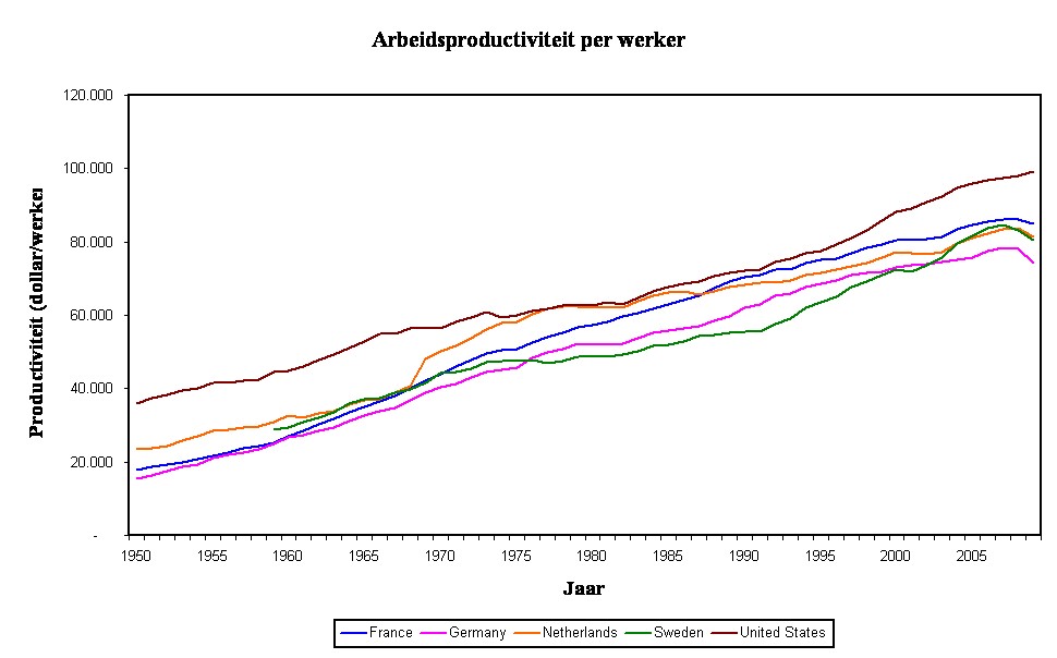
Figure 3: Labour productivity per worker
The situation is different, when the labour productivity per worker is considered. Suppose that there is a total of L workers, then the definition is lp(h) = X/L. The figure 3 shows lp(h) for the same states as those in the figure 1. The data are again taken from the CBTED, and the universal measure of value is also here the spending power of the dollar at the price level of 2009. At first sight there is little difference between the figures 2 and 3. On a closer inspection it is striking, that since 1990 the lp(h) per worker in the USA becomes larger than the lp(h) in Europe. This is caused by the already mentioned longer American working-times. One may hope, that these shorter working-times contribute to a superior society, perhaps due to mentally more healthy people.
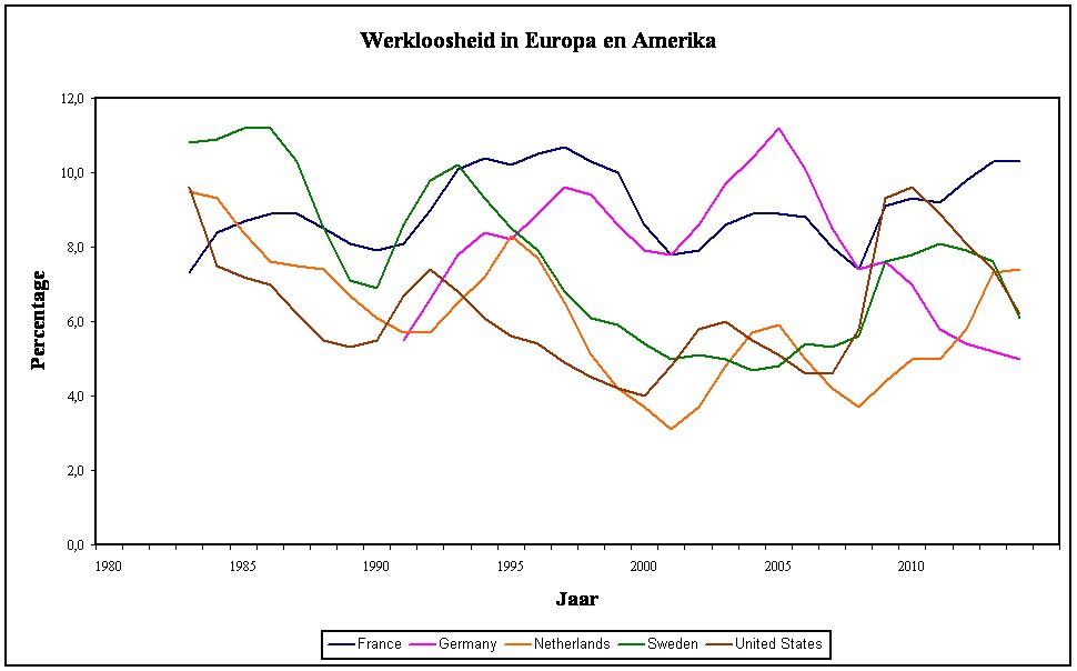
Figure 4: Unemployment (in % of the professional population)
It is obvious that the growth is partly determined by the degree, in which a state succeeds in optimally using its production factors. The percentage of unemployment measures the capacity utilization for the factor labour. That is to say, the number of unemployed is computed as the percentage of the available professional population. The data for the employment can be taken from the file ESD of Eurostat. There time series can be found for the five mentioned states. However, the series merely begin at the year 1985, when the world was still recovering from the two oil crises. At that moment the unemployment has reached historical heights everywhere. The data for Germany even merely start after the unification of the FRG and the GDR. The figure 5 shows the development of the unemployment.
Unemployment is a complex phenomenon, and its causes are actually not well understood. Full employment can never exist, because there are always individuals busy trying to enter a new sphere of occupation. This is called the friction unemployment5. The unemployment can not be reduced below the friction unemployment. Naturally, here the problem is, that nobody exactly knows the height of the friction unemployment. Namely, it depends partly on the structure of the labour market and its institutions. And that structure and institutions differ for each place and time. Nonetheless, it is striking that in France and Germany the full employment is never approached during the considered period. At first sight the USA succeed best in combatting the unemployment.
Furthermore, the conclusion seems justified that the Agenda-2010 policy of chancellor Schröder turns out to work, although this was achieved at a social price6. The German unemployment keeps falling even after the financial crisis of 2007. However, in this comparison between various states it must be considered, that their labour markets are rather different. Therefore it is difficult to find a general definition of unemployment, that does justice to the hallmarks of all those systems. For instance, sometimes individuals disappear from the unemployment statistics, because they become simply too discouraged to still search for a job. It is questionable whether statistics, that ignore this group, give a realistic impression of the employment. The same argument holds for the Dutch finding to simply remove unemployed from the statistics by labeling them as unfit for work. In short, a low unemployment is not always the same as a well functioning labour market.
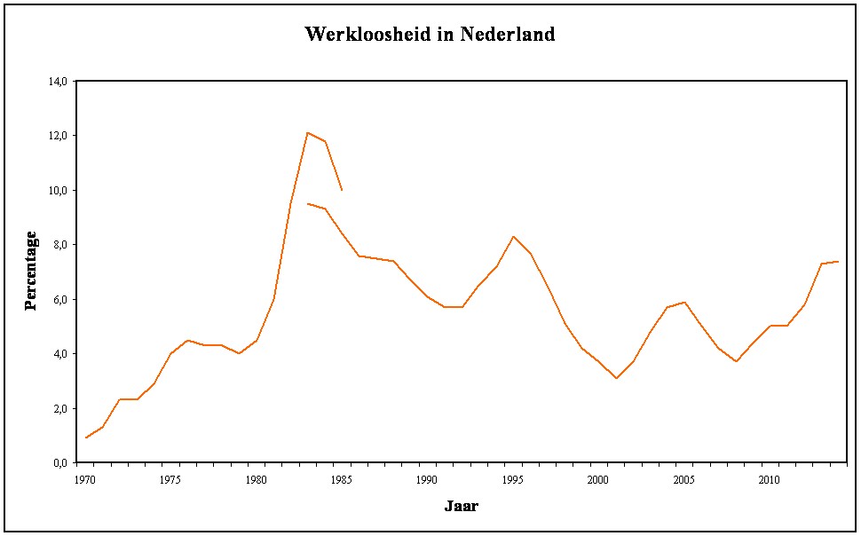
Figure 5: Unemployment (in % of the professional population) in the Netherlands
So in fact the differences between the various states in the figure 4 are not very significant. Perhaps more can be learnt by analyzing the time series of a single state. The figure 5 shows again the series for the Netherlands, supplemented with data from another source than ESD (namely, a book by Flip de Kam7). The supplement shows the unemployment between 1970 and 1985. The reader may observe that the data of De Kam do not nicely connect with the ESD data. For 1983 the ESD reports an unemployment of 9.5%, whereas De Kam mentions a number of 12%. Apparently, here two different definitions and formulas are used to compute the unemployment. The confusion is further increased by a source, that for 1983 cites the numbers 15.4% and even 17.7%8.
Apparently care must be taken, when the various economic systems are compared. Such a detailed analysis is beyond the ambitions of this column. In despite of the contradictions even in the figure 5 it is evident, that at the start of the seventies the friction unemployment is still minimal. Incidentally, the same holds for the years preceding 1970, when in the Netherlands (and in Europe) an almost complete employment was realized. Around 1981 the western prosperity collapsed by a combination of the oil crises and the unchaining globalization. In the Netherlands the decay of 1981 is particularly severe due to a national peculiarity, namely the presence of natural gas. This causes the Dutch disease, since it keeps the exchange rate of the guilder at a high level, and thus hurts the export. So this national disaster is not a system failure.
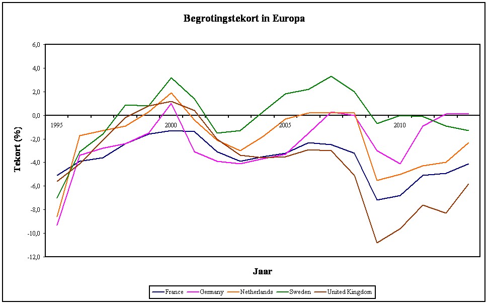
Figure 6: Budget deficits (in % of the GDP) in Europe
When the economic growth stagnates, then the state can maintain the activity by living beyond its means, and borrowing the needed money. This apparently irresponsible behaviour even finds a theoretical support in the policy recommendations of the economists Kalecki and Keynes. Politicians love the budgetary policy, because they can buy the favour of the electorat at the short term, whereas the disadvantages become noticeable only at the long term. The policy has the consequence, that a budget deficit is created. The figure 6 shows the budget deficits for several states in the European Union. The data have been taken from the file of Eurostat. Since the ESD does not contain data for the deficit of the USA, instead the deficit in Great Britain is included. Thus the figure still contains a representative of the Anglosaxon policy.
The time series start merely in 1990. That is a pity, because longer time series clearly depict the rise of the Kaleckian-Keynesian budgetary policy. For instance, the book of De Kam presents a time series for the Netherlands, since 1900, where the state revenues and expenses are commonly in equilibrium. Merely during the two worldwars more is expended than received. However, since 1965 the expenses structurally start to surpass the revenues9. On the other hand, the nineties are very interesting, because the European Act in 1986 has outlined the way towards a European monetary unit. In 1996 that path leads to signing the Stability- and growth-pact (in short SGP). The pact restricts the structural budget deficit of the member states to maximally 3% of the GDP. The figure 6 illustrates that the member states of the euro zone (France, Germany, and the Netherlands) try to reduce the deficit to below the allowed limit.
Thanks to the effort in the nineties the states satisfy the deficit norm in 2002, the year when the euro is introduced. But old habits die hard, and a few years later both Germany and France break the norm, without being punished for it. The situation since 2007 is truly interesting, because the financial crisis begins. During such calamities the SGP gives some margins for higher state expenses, because these can soften the economic shock. It is hoped that the landing will be smooth. But the pact obliges the states to finally yet again structurally satisfy the deficit norm. The figure 6 illustrates, that here the French state is a bit recalcitrant, and struggles with the budgetary discipline. Great Britain is not tied to the pact and allows a clearly larger deficit. On the other hand, Sweden succeeds even during the crisis to maintain a minimal deficit.
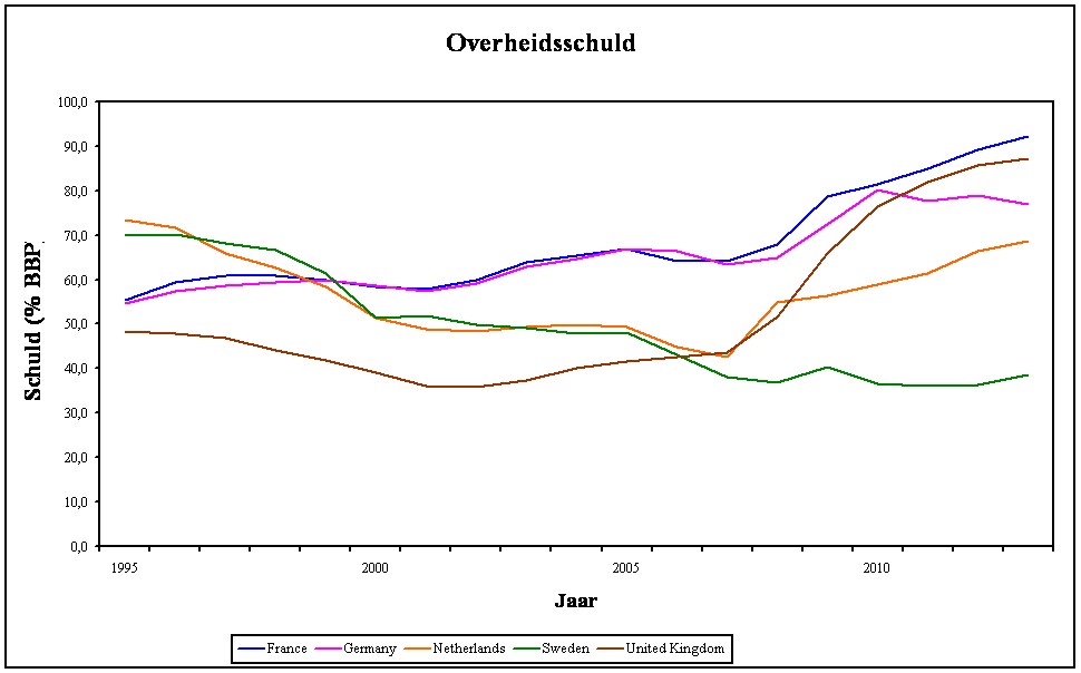
Figure 7: Budget deficits (in % of the GDP) in Europe
The budgetary norm of the pact aims to limit the public debt. For, a public debt leads to high costs for redemption and interest, which must be paid by the citizens. When the formation of debt escalates, then the state can no longer bear that burden. However, the budgetary norm is nothing more than an imperfect brake on the process, and therefore the pact supplements it with a norm about the public debt. For, the public debt must not surpass 60% of the GDP. The figure 7 shows the public debts of the already mentioned European states, based on the data in the ESD. It is clear that Germany and France do not even satisfy the norm for the public debt at the moment, when in 2002 the eurozone is launched. During the Great Recession notably Great Britain and France accumulate large debts. Germany is at the moment again approaching 60%, and Sweden (not a member of the eurozone) even performs excellently.
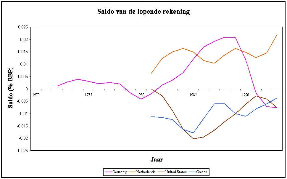
Figure 8: Balance of the current account
One wonders why some states perform better than others. It has just been shown that in the modern industrial states the labour productivity per hour lp(h) is everywhere approximately the same. Now the cost control in the production turns out to be the decisive factor. The USA and nowadays also Germany (with the Agenda-2010) and Sweden prove to be succesful in this respect. It is said that they employ a supply-side policy. On the other hand, France prefers a demand-side policy, where it is attempted to push up the domestic spending power. That has the accompanying effect of also raising the costs. The consequence is that at the moment for instance Germany has a higher competitive power than France. This is illustrated in the figure 8, where the balance of the current account is shown for several European states. The balance of the current account approximately equals the trade balance.
Namely, the balance of the current account measures the difference between the import and export of goods and services. Thus the balance contains the balance of goods (say, the trade balance) and the account of services. Moreover the balance contains the account of incomes, that is to say, the international capital flows due to labour and interest on capital abroad. And finally the balance contains the transfers of incomes, that is to say the effortless donations that enter and leave the state10. In the figure 8 the balance is shown as a percentage of the GDP, and is expressed in the European currency unit (in short ECU, the predecessor of the euro)11. And the GDP is taken from the CBTED, and have just been used in the computation of the growth rates. The CBTED uses as the unit of value the dollar of 2009.
Thus the values of the balances in the figure 8 contain a somewhat strange conversion factor, which actually should be removed. Your columnist does not do this, because the figure serves merely to illustrate the differences between states. Firstly, states such as the Netherlands (partly due to the natural gas) and Germany have a permanently positive balance with respect to foreign states. They are competitive. However, Greece has a permanently negative balance, due to insufficient competitive power (read: too high production costs). There is a continuous capital flow out of Greece, and that process is not sustainable in the long term.
It is interesting, that since 1985 the USA also have a permanently negative balance. Nevertheless, this federation is not commonly known as a poor society. Apparently a state can maintain a negative balance of the current account, as long as others are willing to replenish the deficits. The North-American economy has such a good reputation, that the USA receive, together with their imports, the foreign capital flows needed to pay for these imports!
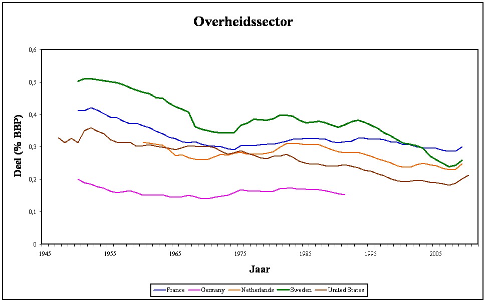
Figure 9: Share of the public sector (% of total)
Finally the question arises how the structure of the state contributes to the economic growth. The figure 9 shows the share of the state in the total nationally added value (expressed in %). In this case the data have been taken from the Groningen Growth and Development Centre ten-sector data file. In Germany the share is smallest, probably because mainy expenses are delegated to the federal states. The time series of France, the USA and Sweden are most interesting for a comparison of systems. According to the sociologist Heiner Ganßmann there are three systems, namely the conservative, liberal and social-democratic ones. These systems can be found in respectively the Rhineland, the anglosaxon states, and the scandinavian states12.
It is clear that originally the social-democratic model is characterized by a large state sector. But after the occurrence of a crisis in Sweden during the nineties, the government there has radically reformed the system. At the moment the share of the state in Sweden is even smaller than the share of the state in the "conservative" France. So although this column is not sufficiently profound to make a motivated choice between the three systems, in any case it is clear that economic growth benefits from a relatively meagre (read: efficient) state apparatus. Next the ideological choice of system determines the competencies and the power, that the state will actually obtain.